Once you have collected your data, you need to present it in a way that is logical and understood by other scientist. Scientists do this by writing a practical report. Here they describe what they did in an experiment, how they analyzed their data and what they found out.
Prac reports
Prac reports include the following sections:
-
Heading: include the name and date of your investigation and who was on your team
-
Purpose: The purpose (or aim) is where you describe briefly what you are trying to do.
-
Hypothesis: an educated guess about what might happen in an experiment and what might be found out
-
Materials: a comprehensive list of everything you used in the investigation. This includes which chemicals and equipment or apparatus used.
-
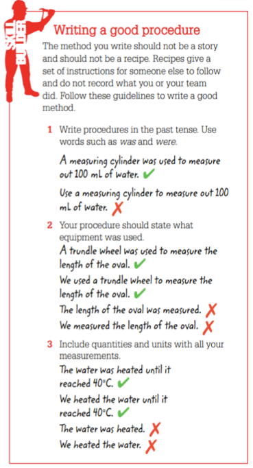
Procedure- The procedure (or method) is a description of everything that you did in the investigation, perhaps as a list or series of dot points. A labelled diagram is a good way to describe how equipment was set up
- Results- This section includes a complete list of your observations and your measurements. They best way to display your measurements is in a table.
- Discussion- This is where you discuss your experimetn, often by answering a set of questions. In the practical review, you:
- describe what happened in your investigation and explain why it happened
- Discuss what you think your results show
- Include second- hand data that relates to your investigation
- describe the problems encountered and what was done to overcome them
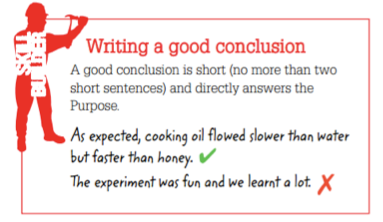
- Construct a conclusion, a brief summary of what you found out in the investigation
- assess your investigation. This concludes assessing whether your hypothesis was accurate or not, suggesting alternative procedure that might improve the investigation and ideas for further experiments
Resource list- if you created your report by using second hand i investigation you must come up with a bibliography.
Graphing data
Graphs are better than tables at showing patterns in data
-
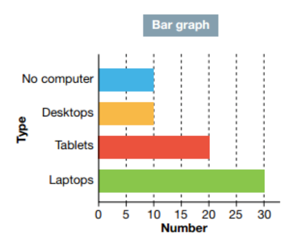
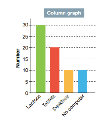
Bar graphs and column graphs have a set of continuous numbers along one axis, and discrete (non-continuous) quantities like colours or materials along the other axis.
Histograms have a set of continuous numbers along one axis and a set of continuous number ranges along the other axis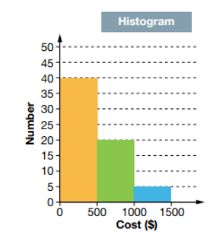
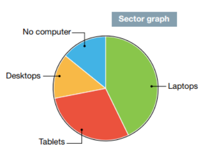
Sector graphs or pie charts show the proportions or percentages of different discrete quantities
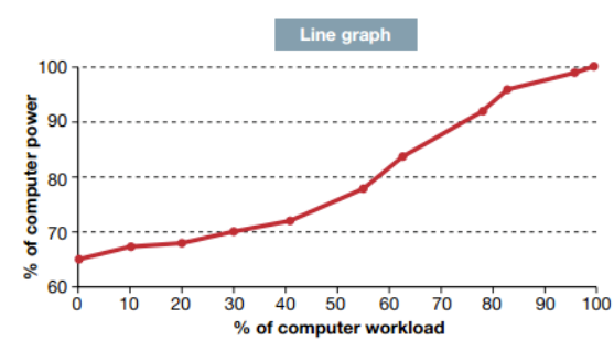
Line graphs have sets of continuous numbers along both axes
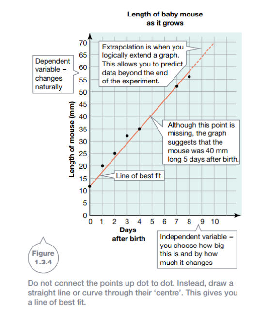
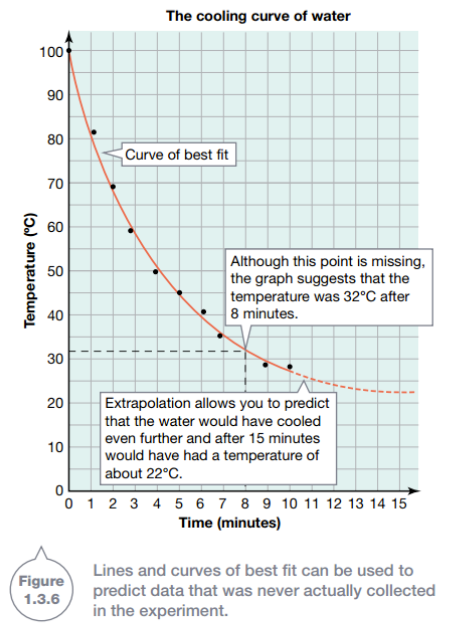
Line or curve of best fit
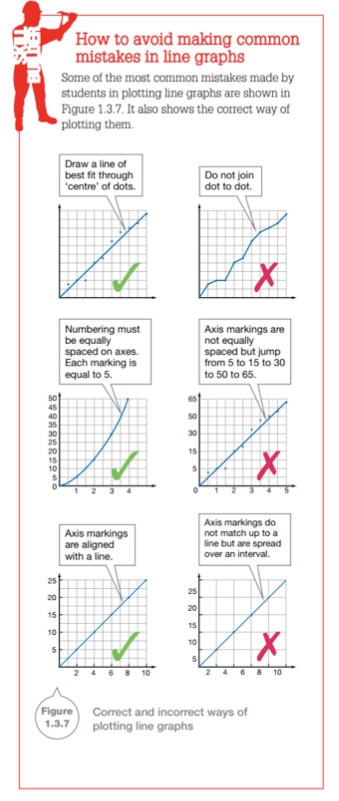
Sometimes your data will product perfect straight lines or perfect cruves. At other times, your data might produce something that looks more like a dot-to-dot picture. This is when you try and construct a line of best fit or curve of best fit.
All experiments have errors in them. This means that the points on your graph have errors too and their positions are not exact. Connecting up the points in a dot-to-dot manner suggests that there is no error. It is more sensible to draw a straight line or smooth curve roughly through the ‘centre’ of your points. These lines or curves of best fit make patterns in your results easier to see. They also allow you to predict any missing measurements.
Line graphs can also be extrapolated. Extrapolation is when a line graph is extended beyond its final measured value, allowing you to predict further measurements.
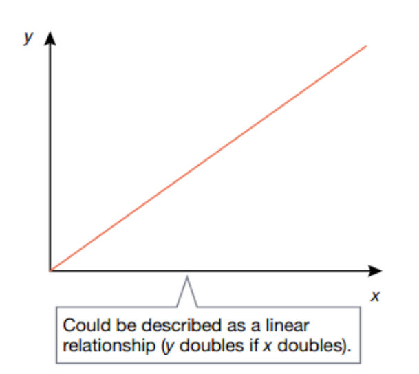
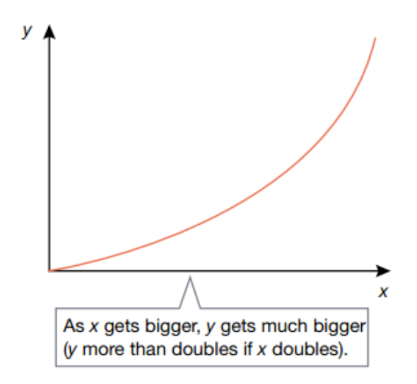
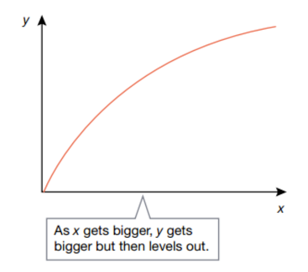
Describing patterns
Graphs that produce straight lines or logical curves indicate that there is a pattern, a rule or relationship between the variables that you tested